> ## Documentation Index
> Fetch the complete documentation index at: https://docs.caldera.xyz/llms.txt
> Use this file to discover all available pages before exploring further.
# Theming
> Customize the appearance of the Metalayer Bridge Widget
## Overview
The Metalayer Bridge Widget offers extensive theming capabilities to match your application's design. You can use predefined themes for quick setup or customize every aspect of the widget's appearance.
### Widget Properties
| Property | Type | Description |
| ------------ | -------------------------------------------------------- | ------------------------------- |
| `predefined` | `'comfy' \| 'modern'` | Use a predefined theme |
| `mode` | `'light' \| 'dark'` | Color mode |
| `colors` | **[ThemeColors](#available-palettes)** | Custom color palette |
| `corners` | `'none' \| 'minimal' \| 'soft' \| 'medium' \| 'rounded'` | Border radius style |
| `shadow` | `'none' \| 'sharp' \| 'light' \| 'heavy'` | Shadow style |
| `features` | **[ThemeFeatures](#widget-features)** | Feature toggles |
| `fontFamily` | **[FontFamily](#fontfamily)** | Font family configuration |
| `fonts` | **[FontsConfig](#fontsconfig)** | Font loading configuration |
| `overrides` | `Partial<`**[Theme](#theme-object-structure)**`>` | Direct theme property overrides |
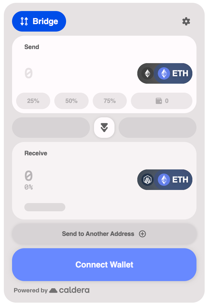
## Color Palette
Using a single Hex color, the widget will generate a color palette for the widget.
 ```tsx theme={null}
```
### Available Palettes
The color palette properties that can be used to customize the widget.
| Property | Type | Description |
| --------- | -------- | -------------------------------------- |
| `primary` | `string` | Primary brand color (hex format) |
| `neutral` | `string` | Neutral/gray color (hex format) |
| `success` | `string` | Success state color (hex format) |
| `warning` | `string` | Warning state color (hex format) |
| `info` | `string` | Info state color (hex format) |
| `failure` | `string` | Error/failure state color (hex format) |
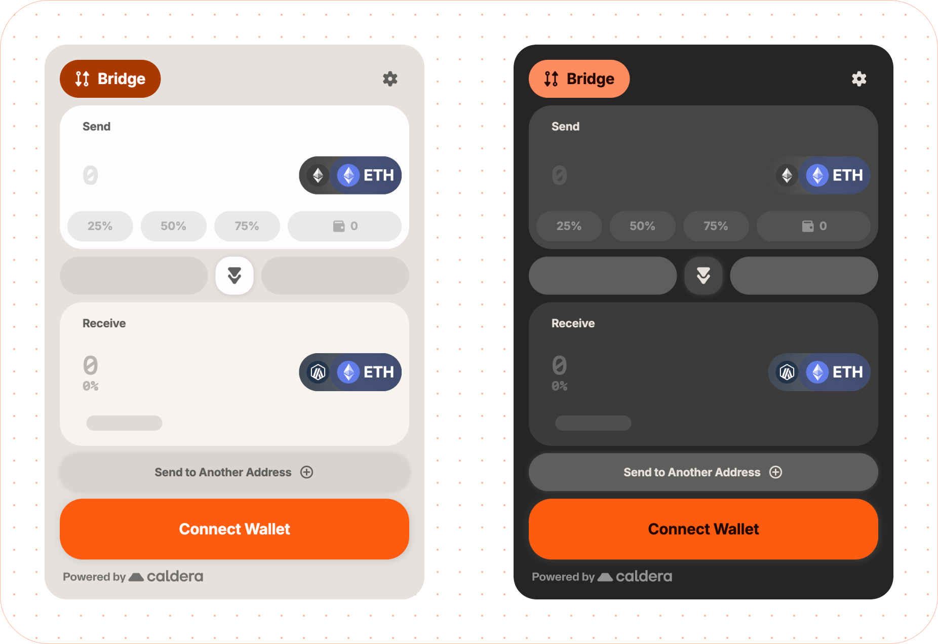
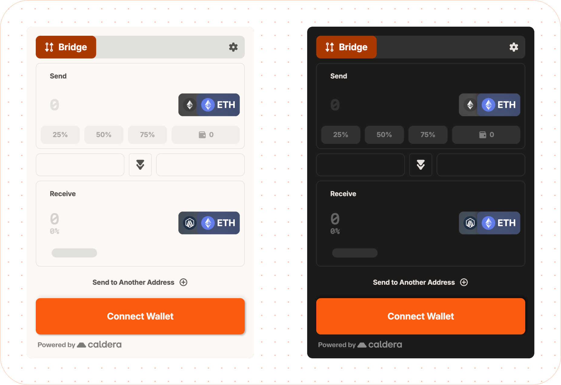
## Predefined Themes
The widget includes two predefined themes that provide a complete, cohesive look out of the box.
### Comfy Theme
The default theme with a warm, approachable aesthetic.
```tsx theme={null}
```
### Available Palettes
The color palette properties that can be used to customize the widget.
| Property | Type | Description |
| --------- | -------- | -------------------------------------- |
| `primary` | `string` | Primary brand color (hex format) |
| `neutral` | `string` | Neutral/gray color (hex format) |
| `success` | `string` | Success state color (hex format) |
| `warning` | `string` | Warning state color (hex format) |
| `info` | `string` | Info state color (hex format) |
| `failure` | `string` | Error/failure state color (hex format) |
## Predefined Themes
The widget includes two predefined themes that provide a complete, cohesive look out of the box.
### Comfy Theme
The default theme with a warm, approachable aesthetic.
 ```tsx theme={null}
```
### Modern Theme
A sleek, contemporary design with sharper edges and a more minimal feel.
```tsx theme={null}
```
### Modern Theme
A sleek, contemporary design with sharper edges and a more minimal feel.
 ```tsx theme={null}
```
### Dark Mode
Enable dark mode on any theme by setting the `mode` property:
```tsx theme={null}
```
## Font Customization
The widget uses three font roles: **label** (headings/labels), **body** (body text), and **data** (numeric/monospace). Default fonts are Inter and Martian Mono.
#### Google Fonts
Specify font names for auto-loading from Google Fonts:
```tsx theme={null}
```
#### Recommended Fonts by Role
| Role | Recommended Google Fonts |
| ------- | ------------------------------------------------------------------------------------------------------------------------------ |
| `label` | Inter, Montserrat, Fredoka, Oswald, Manrope, Merriweather, Noto Serif Display, Roboto, Jua, Bitcount |
| `body` | Inter, Montserrat, Manrope, Merriweather, Noto Serif Display, Roboto, Fredoka, Fira Code, Roboto Mono, Kode Mono, Martian Mono |
| `data` | Fira Code, Roboto Mono, Kode Mono, Martian Mono, Roboto, Inter, Montserrat, Manrope |
#### Google Fonts with Custom Weights
```tsx theme={null}
```
#### Custom Weight Choices
For more control over which font weights are used for regular and bold text, pass an object instead of a string:
```tsx theme={null}
```
**Default weights by role:**
| Role | `base` | `bold` |
| ----- | ------ | ------ |
| label | 700 | - |
| body | 400 | - |
| data | 500 | 700 |
The `bold` weight is currently only supported for the `data` role. Setting `bold` on `label` or `body` will show a dev warning and be ignored.
#### Custom Fonts
For fonts not on Google Fonts, use `customFonts` with woff2 URLs:
```tsx theme={null}
```
For multiple weights:
```tsx theme={null}
fonts: {
customFonts: [{
family: 'MyBrandFont',
weights: [
{ weight: 400, url: 'https://cdn.example.com/mybrand-regular.woff2' },
{ weight: 700, url: 'https://cdn.example.com/mybrand-bold.woff2' },
],
}]
}
```
#### System Fonts
```tsx theme={null}
theme={{
fontFamily: {
label: 'system-ui',
body: '-apple-system',
data: 'ui-monospace',
}
}}
```
#### FontFamily
| Property | Type | Description |
| -------- | ---------------------------- | ------------------------------- |
| `label` | `string \| FontFamilyConfig` | Font for headings and labels |
| `body` | `string \| FontFamilyConfig` | Font for body text |
| `data` | `string \| FontFamilyConfig` | Font for numeric/monospace data |
#### FontsConfig
| Property | Type | Description |
| ------------- | ------------------- | ---------------------------------- |
| `googleFonts` | `GoogleFontsConfig` | Google Fonts loading configuration |
| `customFonts` | `CustomFont[]` | Custom font definitions |
#### FontFamilyConfig
| Property | Type | Description |
| --------- | ---------------------------------- | --------------------------- |
| `family` | `string` | Font family name (required) |
| `weights` | `{ base?: number; bold?: number }` | Font weight configuration |
The `bold` weight in `weights` is only supported for the `data` role.
#### GoogleFontsConfig
| Property | Type | Description |
| ---------- | --------------------------------------------------------- | --------------------------------------------------------------------- |
| `families` | `string[]` | Font families with weights (e.g., `'Roboto:wght@400;700'`) (required) |
| `display` | `'auto' \| 'block' \| 'swap' \| 'fallback' \| 'optional'` | Font display strategy |
#### CustomFont
| Property | Type | Description |
| --------- | ----------------------------------- | ---------------------------------------------- |
| `family` | `string` | Font family name (required) |
| `url` | `string` | Single woff2 font URL (weight defaults to 400) |
| `weights` | `{ weight: number; url: string }[]` | Multiple weight definitions |
Either `url` or `weights` must be provided for custom fonts.
## Widget Features
Toggle specific visual features of the widget on or off.
| Property | Type | Description |
| ------------------- | --------- | ----------------------- |
| `headerIcons` | `boolean` | Show header icons |
| `headerBackground` | `boolean` | Show header background |
| `background` | `boolean` | Show widget background |
| `outlineComponents` | `boolean` | Show component outlines |
```tsx theme={null}
```
## Advanced Overrides
For complete control, use the `overrides` property to customize specific theme values. This allows you to override any part of the generated theme.
```tsx theme={null}
```
These types are used when customizing advanced theme overrides.
#### StatusColors
There are 4 types of statuses: info, warning, success, and failure.
| Property | Type | Description |
| ------------ | -------- | ------------------------------------------- |
| `main` | `string` | Main status color (hex format) |
| `foreground` | `string` | Text color for status elements (hex format) |
| `light` | `string` | Lighter variant (hex format) |
| `dark` | `string` | Darker variant (hex format) |
#### InteractiveColors
| Property | Type | Description |
| ---------- | -------- | ----------------------------------------- |
| `active` | `string` | Color when element is active (hex format) |
| `hover` | `string` | Color on hover (hex format) |
| `inactive` | `string` | Color when inactive (hex format) |
| `disabled` | `string` | Color when disabled (hex format) |
| `contrast` | `string` | Contrasting text/icon color (hex format) |
#### InteractiveThemeColors
| Property | Type | Description |
| ----------- | ---------------------------------------- | -------------------------------------- |
| `primary` | `InteractiveColors` | Primary interactive element colors |
| `secondary` | `InteractiveColors` | Secondary interactive element colors |
| `tertiary` | `InteractiveColors` | Tertiary interactive element colors |
| `input` | `{ active?: string; inactive?: string }` | Input field border colors (hex format) |
#### Theme Object Structure
The complete theme object structure for advanced overrides. All properties are optional.
| Property | Type | Description |
| ------------- | ------------------------------------------------------------------------------ | ---------------------------------------------------------- |
| `brand` | `string` | Brand accent color (hex format) |
| `background` | `{ main?: string; layer1?: string; layer2?: string; layer3?: string }` | Background colors for elevation layers |
| `text` | `{ primary?: string; secondary?: string; disabled?: string }` | Text colors |
| `interactive` | `InteractiveThemeColors` | Interactive element colors |
| `status` | `StatusColors` | Status indication colors (info, warning, success, failure) |
| `misc` | `{ divider?: string; footer?: string; skeleton?: string; highlight?: string }` | Miscellaneous UI colors |
| `shadows` | `{ bottom?: string; around?: string }` | Shadow CSS values |
All color values should be provided in hex format (e.g., `#RRGGBB` or `#RGB`).
```tsx theme={null}
```
### Dark Mode
Enable dark mode on any theme by setting the `mode` property:
```tsx theme={null}
```
## Font Customization
The widget uses three font roles: **label** (headings/labels), **body** (body text), and **data** (numeric/monospace). Default fonts are Inter and Martian Mono.
#### Google Fonts
Specify font names for auto-loading from Google Fonts:
```tsx theme={null}
```
#### Recommended Fonts by Role
| Role | Recommended Google Fonts |
| ------- | ------------------------------------------------------------------------------------------------------------------------------ |
| `label` | Inter, Montserrat, Fredoka, Oswald, Manrope, Merriweather, Noto Serif Display, Roboto, Jua, Bitcount |
| `body` | Inter, Montserrat, Manrope, Merriweather, Noto Serif Display, Roboto, Fredoka, Fira Code, Roboto Mono, Kode Mono, Martian Mono |
| `data` | Fira Code, Roboto Mono, Kode Mono, Martian Mono, Roboto, Inter, Montserrat, Manrope |
#### Google Fonts with Custom Weights
```tsx theme={null}
```
#### Custom Weight Choices
For more control over which font weights are used for regular and bold text, pass an object instead of a string:
```tsx theme={null}
```
**Default weights by role:**
| Role | `base` | `bold` |
| ----- | ------ | ------ |
| label | 700 | - |
| body | 400 | - |
| data | 500 | 700 |
The `bold` weight is currently only supported for the `data` role. Setting `bold` on `label` or `body` will show a dev warning and be ignored.
#### Custom Fonts
For fonts not on Google Fonts, use `customFonts` with woff2 URLs:
```tsx theme={null}
```
For multiple weights:
```tsx theme={null}
fonts: {
customFonts: [{
family: 'MyBrandFont',
weights: [
{ weight: 400, url: 'https://cdn.example.com/mybrand-regular.woff2' },
{ weight: 700, url: 'https://cdn.example.com/mybrand-bold.woff2' },
],
}]
}
```
#### System Fonts
```tsx theme={null}
theme={{
fontFamily: {
label: 'system-ui',
body: '-apple-system',
data: 'ui-monospace',
}
}}
```
#### FontFamily
| Property | Type | Description |
| -------- | ---------------------------- | ------------------------------- |
| `label` | `string \| FontFamilyConfig` | Font for headings and labels |
| `body` | `string \| FontFamilyConfig` | Font for body text |
| `data` | `string \| FontFamilyConfig` | Font for numeric/monospace data |
#### FontsConfig
| Property | Type | Description |
| ------------- | ------------------- | ---------------------------------- |
| `googleFonts` | `GoogleFontsConfig` | Google Fonts loading configuration |
| `customFonts` | `CustomFont[]` | Custom font definitions |
#### FontFamilyConfig
| Property | Type | Description |
| --------- | ---------------------------------- | --------------------------- |
| `family` | `string` | Font family name (required) |
| `weights` | `{ base?: number; bold?: number }` | Font weight configuration |
The `bold` weight in `weights` is only supported for the `data` role.
#### GoogleFontsConfig
| Property | Type | Description |
| ---------- | --------------------------------------------------------- | --------------------------------------------------------------------- |
| `families` | `string[]` | Font families with weights (e.g., `'Roboto:wght@400;700'`) (required) |
| `display` | `'auto' \| 'block' \| 'swap' \| 'fallback' \| 'optional'` | Font display strategy |
#### CustomFont
| Property | Type | Description |
| --------- | ----------------------------------- | ---------------------------------------------- |
| `family` | `string` | Font family name (required) |
| `url` | `string` | Single woff2 font URL (weight defaults to 400) |
| `weights` | `{ weight: number; url: string }[]` | Multiple weight definitions |
Either `url` or `weights` must be provided for custom fonts.
## Widget Features
Toggle specific visual features of the widget on or off.
| Property | Type | Description |
| ------------------- | --------- | ----------------------- |
| `headerIcons` | `boolean` | Show header icons |
| `headerBackground` | `boolean` | Show header background |
| `background` | `boolean` | Show widget background |
| `outlineComponents` | `boolean` | Show component outlines |
```tsx theme={null}
```
## Advanced Overrides
For complete control, use the `overrides` property to customize specific theme values. This allows you to override any part of the generated theme.
```tsx theme={null}
```
These types are used when customizing advanced theme overrides.
#### StatusColors
There are 4 types of statuses: info, warning, success, and failure.
| Property | Type | Description |
| ------------ | -------- | ------------------------------------------- |
| `main` | `string` | Main status color (hex format) |
| `foreground` | `string` | Text color for status elements (hex format) |
| `light` | `string` | Lighter variant (hex format) |
| `dark` | `string` | Darker variant (hex format) |
#### InteractiveColors
| Property | Type | Description |
| ---------- | -------- | ----------------------------------------- |
| `active` | `string` | Color when element is active (hex format) |
| `hover` | `string` | Color on hover (hex format) |
| `inactive` | `string` | Color when inactive (hex format) |
| `disabled` | `string` | Color when disabled (hex format) |
| `contrast` | `string` | Contrasting text/icon color (hex format) |
#### InteractiveThemeColors
| Property | Type | Description |
| ----------- | ---------------------------------------- | -------------------------------------- |
| `primary` | `InteractiveColors` | Primary interactive element colors |
| `secondary` | `InteractiveColors` | Secondary interactive element colors |
| `tertiary` | `InteractiveColors` | Tertiary interactive element colors |
| `input` | `{ active?: string; inactive?: string }` | Input field border colors (hex format) |
#### Theme Object Structure
The complete theme object structure for advanced overrides. All properties are optional.
| Property | Type | Description |
| ------------- | ------------------------------------------------------------------------------ | ---------------------------------------------------------- |
| `brand` | `string` | Brand accent color (hex format) |
| `background` | `{ main?: string; layer1?: string; layer2?: string; layer3?: string }` | Background colors for elevation layers |
| `text` | `{ primary?: string; secondary?: string; disabled?: string }` | Text colors |
| `interactive` | `InteractiveThemeColors` | Interactive element colors |
| `status` | `StatusColors` | Status indication colors (info, warning, success, failure) |
| `misc` | `{ divider?: string; footer?: string; skeleton?: string; highlight?: string }` | Miscellaneous UI colors |
| `shadows` | `{ bottom?: string; around?: string }` | Shadow CSS values |
All color values should be provided in hex format (e.g., `#RRGGBB` or `#RGB`).