Overview
The Metalayer Bridge Widget offers extensive theming capabilities to match your application’s design. You can use predefined themes for quick setup or customize every aspect of the widget’s appearance.
Property Type Description predefined'comfy' | 'modern'Use a predefined theme mode'light' | 'dark'Color mode colorsThemeColors Custom color palette corners'none' | 'minimal' | 'soft' | 'medium' | 'rounded'Border radius style shadow'none' | 'sharp' | 'light' | 'heavy'Shadow style featuresThemeFeatures Feature toggles fontFamilyFontFamily Font family configuration fontsFontsConfig Font loading configuration overridesPartial<Theme >Direct theme property overrides
Color Palette
Using a single Hex color, the widget will generate a color palette for the widget.
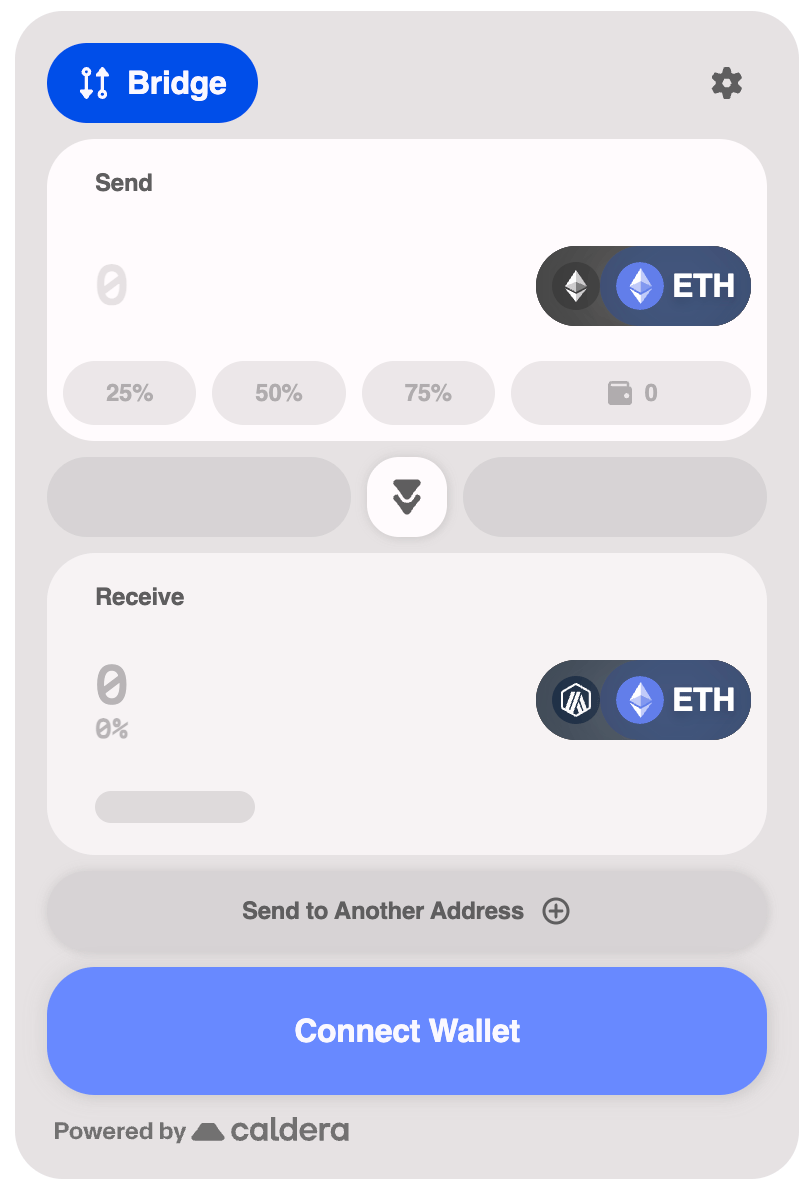
< WidgetProvider
sdkConfig = { sdkConfig }
theme = { {
colors: {
primary: '#0153F7' ,
},
} }
>
Available Palettes
The color palette properties that can be used to customize the widget.
Property Type Description primarystringPrimary brand color (hex format) neutralstringNeutral/gray color (hex format) successstringSuccess state color (hex format) warningstringWarning state color (hex format) infostringInfo state color (hex format) failurestringError/failure state color (hex format)
Predefined Themes
The widget includes two predefined themes that provide a complete, cohesive look out of the box.
Comfy Theme
The default theme with a warm, approachable aesthetic.
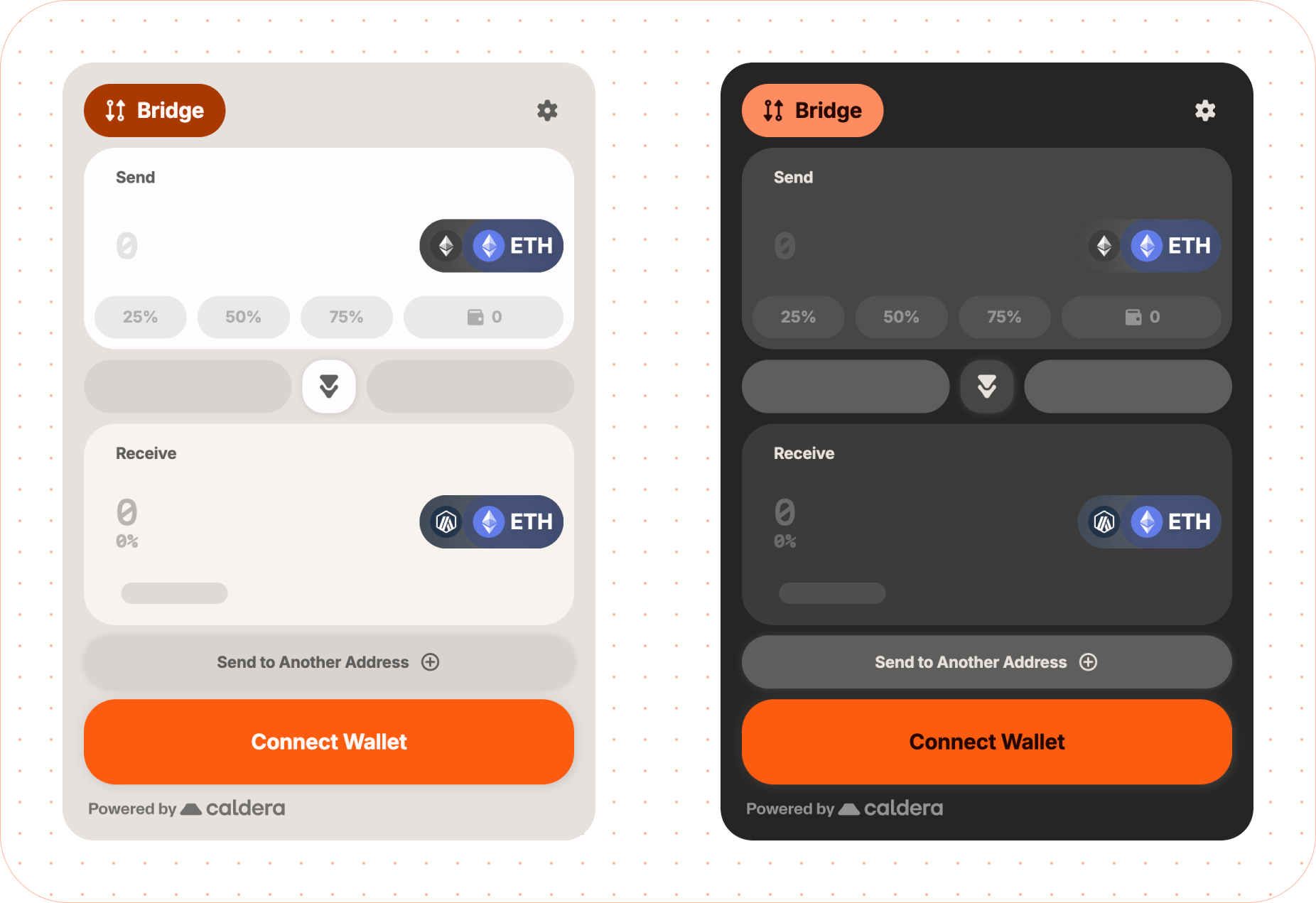
< WidgetProvider
sdkConfig = { sdkConfig }
theme = { { predefined: 'comfy' } }
>
Modern Theme
A sleek, contemporary design with sharper edges and a more minimal feel.
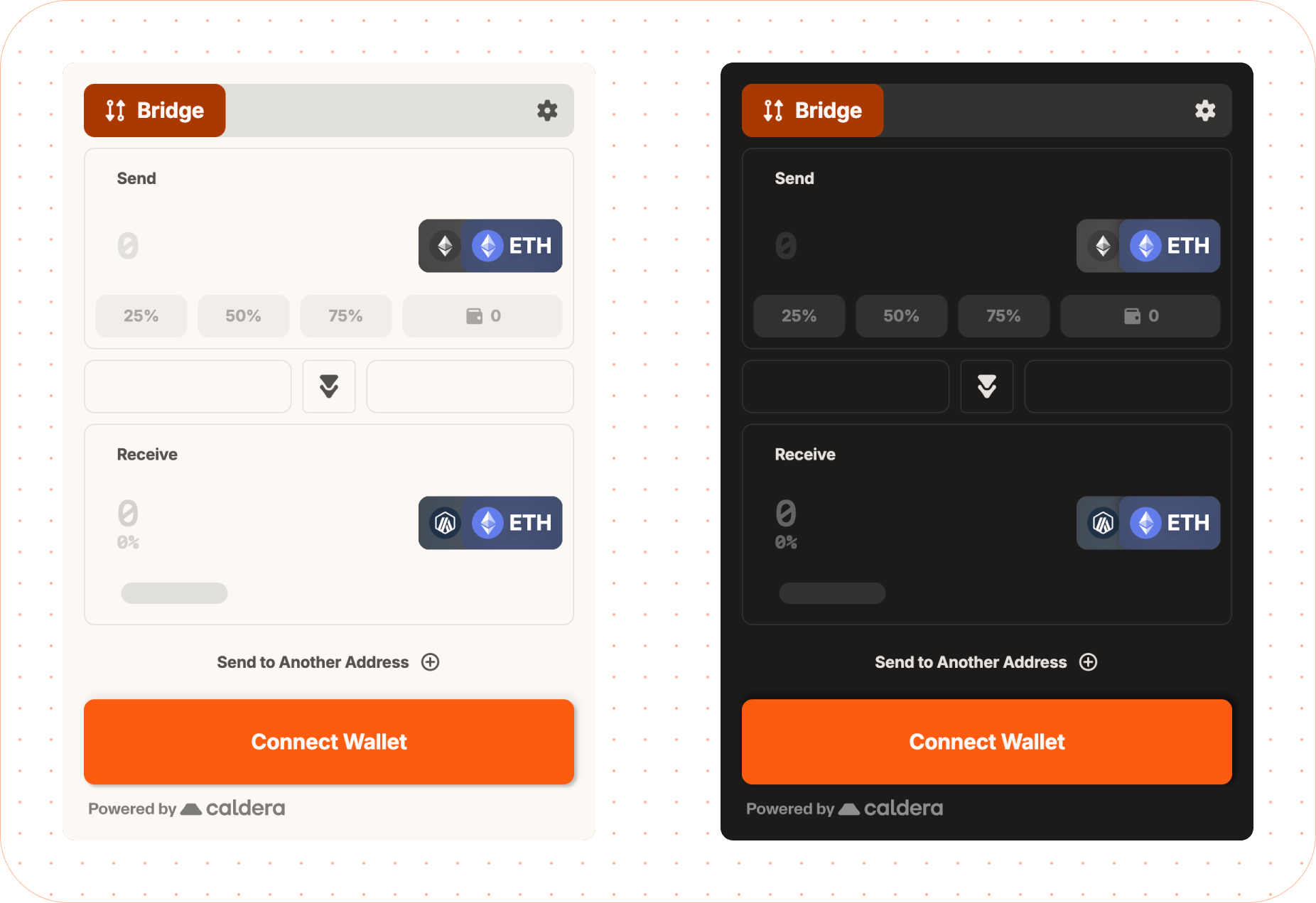
< WidgetProvider
sdkConfig = { sdkConfig }
theme = { { predefined: 'modern' } }
>
Dark Mode
Enable dark mode on any theme by setting the mode property:
< WidgetProvider
sdkConfig = { sdkConfig }
theme = { {
mode: 'dark' ,
predefined: 'modern' ,
} }
>
Font Customization
The widget uses three font roles: label (headings/labels), body (body text), and data (numeric/monospace). Default fonts are Inter and Martian Mono.
Google Fonts
Specify font names for auto-loading from Google Fonts:
< WidgetProvider
sdkConfig = { sdkConfig }
theme = { {
fontFamily: {
label: 'Roboto' ,
body: 'Roboto' ,
data: 'Fira Code' ,
}
} }
>
Recommended Fonts by Role
Role Recommended Google Fonts labelInter, Montserrat, Fredoka, Oswald, Manrope, Merriweather, Noto Serif Display, Roboto, Jua, Bitcount bodyInter, Montserrat, Manrope, Merriweather, Noto Serif Display, Roboto, Fredoka, Fira Code, Roboto Mono, Kode Mono, Martian Mono dataFira Code, Roboto Mono, Kode Mono, Martian Mono, Roboto, Inter, Montserrat, Manrope
Google Fonts with Custom Weights
< WidgetProvider
sdkConfig = { sdkConfig }
theme = { {
fontFamily: { label: 'Roboto' , body: 'Roboto' },
fonts: {
googleFonts: {
families: [ 'Roboto:wght@300;400;500;700;900' ],
display: 'swap' ,
}
}
} }
>
Custom Weight Choices
For more control over which font weights are used for regular and bold text, pass an object instead of a string:
< WidgetProvider
sdkConfig = { sdkConfig }
theme = { {
fontFamily: {
// Simple string (uses default weights)
label: 'Inter' ,
// Object with custom weights
body: { family: 'Inter' , weights: { base: 300 } },
// Data supports base and bold weights
data: {
family: 'Fira Code' ,
weights: { base: 400 , bold: 600 }
},
}
} }
>
Default weights by role:
Role baseboldlabel 700 - body 400 - data 500 700
The bold weight is currently only supported for the data role. Setting bold on label or body will show a dev warning and be ignored.
Custom Fonts
For fonts not on Google Fonts, use customFonts with woff2 URLs:
< WidgetProvider
sdkConfig = { sdkConfig }
theme = { {
fontFamily: {
label: 'MyBrandFont' ,
body: 'MyBrandFont' ,
data: 'Martian Mono' ,
},
fonts: {
customFonts: [{
family: 'MyBrandFont' ,
url: 'https://cdn.example.com/mybrand.woff2' ,
}]
}
} }
>
For multiple weights:
fonts : {
customFonts : [{
family: 'MyBrandFont' ,
weights: [
{ weight: 400 , url: 'https://cdn.example.com/mybrand-regular.woff2' },
{ weight: 700 , url: 'https://cdn.example.com/mybrand-bold.woff2' },
],
}]
}
System Fonts
theme = {{
fontFamily : {
label : 'system-ui' ,
body : '-apple-system' ,
data : 'ui-monospace' ,
}
}}
FontFamily Property Type Description labelstring | FontFamilyConfigFont for headings and labels bodystring | FontFamilyConfigFont for body text datastring | FontFamilyConfigFont for numeric/monospace data
FontsConfig Property Type Description googleFontsGoogleFontsConfigGoogle Fonts loading configuration customFontsCustomFont[]Custom font definitions
FontFamilyConfig Property Type Description familystringFont family name (required) weights{ base?: number; bold?: number }Font weight configuration
The bold weight in weights is only supported for the data role.
GoogleFontsConfig Property Type Description familiesstring[]Font families with weights (e.g., 'Roboto:wght@400;700') (required) display'auto' | 'block' | 'swap' | 'fallback' | 'optional'Font display strategy
CustomFont Property Type Description familystringFont family name (required) urlstringSingle woff2 font URL (weight defaults to 400) weights{ weight: number; url: string }[]Multiple weight definitions
Either url or weights must be provided for custom fonts.
Toggle specific visual features of the widget on or off.
Property Type Description headerIconsbooleanShow header icons headerBackgroundbooleanShow header background backgroundbooleanShow widget background outlineComponentsbooleanShow component outlines
< WidgetProvider
sdkConfig = { sdkConfig }
theme = { {
features: {
// Toggles visibility of icons for labels on the header of the widget
headerIcons: false ,
// Toggles a background for the header of the widget
headerBackground: true ,
// Toggles the background for the widget. If true, the background will be shown and add 16px of padding to the widget.
background: false ,
// Toggles the visibility of outlines for components. If true, the outlines will be shown.
outlineComponents: true ,
}
} }
>
Advanced Overrides
For complete control, use the overrides property to customize specific theme values. This allows you to override any part of the generated theme.
< WidgetProvider
sdkConfig = { sdkConfig }
theme = { {
colors: { primary: '#0153F7' },
overrides: {
background: {
main: '#FFFFFF' ,
layer1: '#F5F5F5' ,
layer2: '#EEEEEE' ,
layer3: '#E0E0E0' ,
},
text: {
primary: '#1A1A1A' ,
secondary: '#666666' ,
disabled: '#9E9E9E' ,
}
}
} }
>
These types are used when customizing advanced theme overrides. StatusColors There are 4 types of statuses: info, warning, success, and failure. Property Type Description mainstringMain status color (hex format) foregroundstringText color for status elements (hex format) lightstringLighter variant (hex format) darkstringDarker variant (hex format)
InteractiveColors Property Type Description activestringColor when element is active (hex format) hoverstringColor on hover (hex format) inactivestringColor when inactive (hex format) disabledstringColor when disabled (hex format) contraststringContrasting text/icon color (hex format)
InteractiveThemeColors Property Type Description primaryInteractiveColorsPrimary interactive element colors secondaryInteractiveColorsSecondary interactive element colors tertiaryInteractiveColorsTertiary interactive element colors input{ active?: string; inactive?: string }Input field border colors (hex format)
Theme Object Structure The complete theme object structure for advanced overrides. All properties are optional. Property Type Description brandstringBrand accent color (hex format) background{ main?: string; layer1?: string; layer2?: string; layer3?: string }Background colors for elevation layers text{ primary?: string; secondary?: string; disabled?: string }Text colors interactiveInteractiveThemeColorsInteractive element colors statusStatusColorsStatus indication colors (info, warning, success, failure) misc{ divider?: string; footer?: string; skeleton?: string; highlight?: string }Miscellaneous UI colors shadows{ bottom?: string; around?: string }Shadow CSS values
All color values should be provided in hex format (e.g., #RRGGBB or #RGB).