Logo
Logo Wordmark
Vertical Logo Wordmark
Grayscale
When brand colors don’t suit your materials or technical constraints exist, use grayscale or black/white versions. Never use unauthorized color variations.Logo Don’ts:
- Don’t stretch or distort the logo
- Don’t use on backgrounds that compete for attention
- Don’t recreate or modify the logo
- Don’t use colors outside the approved palette
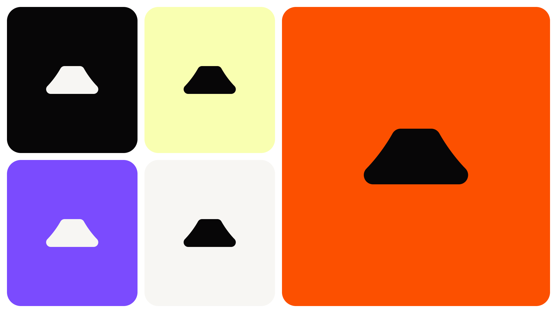
Colors

#FC5000

#7B4BFE
#F9FFB1

#F7F6F3

#070607
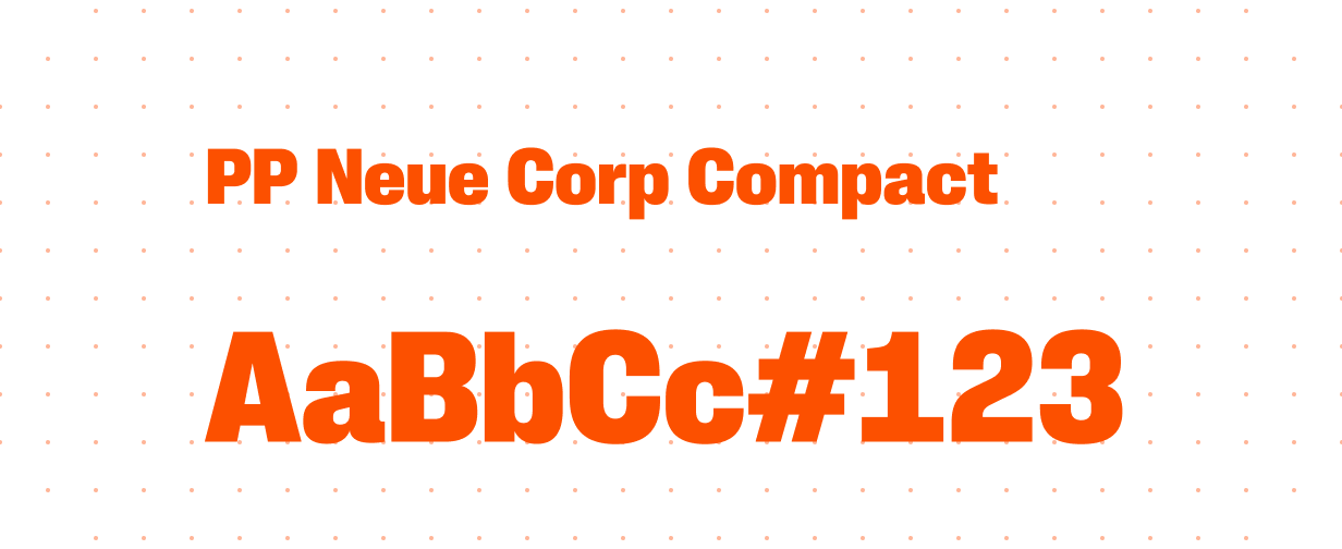
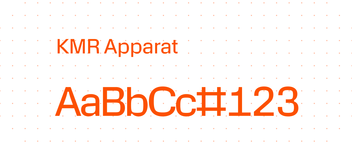
Typography